[Update: TicketTouch does not exist anymore]
In the Summer of 2016 De Lijn announced a new way of paying for your ride on their busses and trams in Flanders, Belgium. They proposed TicketTouch as an easier and cheaper way of buying tickets. The application leaves a lot to be desired however. Here are some of my complaints.
Why isn’t the application native iOS?
This is the first and foremost question. As soon as you launch the app, it feels cheap and "off". TicketTouch is a very simple application with hardly any UI or graphical elements. The application would be easy to create as a native iOS application and feel much more responsive and at home on people’s phones. I think most of the problems would also be solved by making it native iOS.
Allow for passwords to be pasted.
This is a user-hostile “feature”. There is no security gained whatsoever from having password fields that don’t accept pasting passwords. I thought this was established for quite a while now. What it leads to is to users using simple passwords that they can remember by heart because they have to type them in. Users of password-generating applications such as 1Password who care about their security are baffled by this kind of thing. The password here is maybe especially important as it is the PayPal password that is being used. PayPal, obviously, is used for financial transactions.
PayPal only? Why not add other payment methods?
Why force users to create a PayPal account to which they will then link their credit card? What is the business model here? Was some deal made with PayPal to have them as exclusive payment partner? I can't believe De Lijn accepts this as their interface with the customer. It makes users jump through extra hoops. De Lijn should offer more payment methods. Let people choose whether to pay with credit card or PayPal.
The support section of the app can’t be exited.
This is a glaring bug. When a user enters the Settings section of the app and selects Help/FAQ he is lead to a web view of https://www.tickettouch.be/faq. This would be fine if it weren’t so that you can’t get back to the using the app from there. The only way to go back is to quit the app and open it again. There are other inconsistencies. When choosing Introduction in Settings a Start button has to be tapped in order to go back. Tapping T&C or Travelling T&C has a user tap an ‘X’ to go back. None of these send you back to the Settings section but rather to the main screen of the app.
Buying a ticket cannot fail.
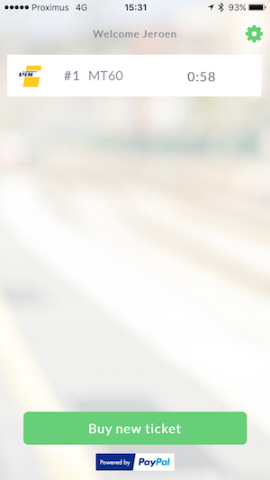
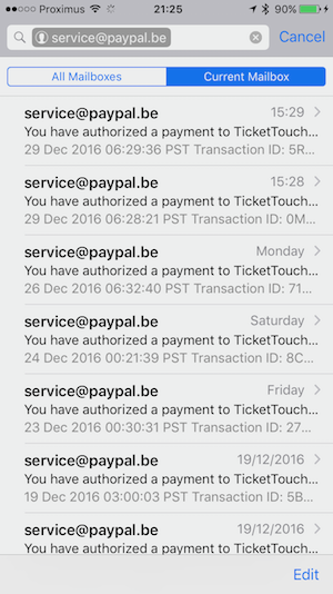
The best gets saved for last. I’ve had a case where I chose “Purchase 60 minutes M-Ticket” and I didn’t get a ticket. It showed the off-center “Purchasing” for a while and then showed the main screen again with no ticket purchased. I tried again by tapping “Purchase 60 minutes M-Ticket” and then it worked. A minute later I get two PayPal emails charging me for 1 ticket each. This is a major usability problem. We are talking about customers being charged for tickets they are not receiving. You can see the screenshots I took and compare the time of the tickets. 2 mails from PayPal, 1 valid ticket.


TicketTouch needs a lesson in how they should make a user-friendly application. When a customer made the intention to purchase a ticket he _has_ a valid ticket. Instantly. He tapped “Buy”, he cannot in any way be faulted for any software bugs that happen after that. What happens now is that the user does not have a ticket until the long processing of the purchase has completed. In urban areas with spotty reception or on moving trams and busses this can prove difficult. But this should not be the user’s problem. What should happen is that the user has a valid ticket as soon as he hits “Buy”. There are 2 ways to do this:
- Either TicketTouch figures out a way to make payments go faster. I don’t know what they’re doing now but in areas with perfect reception making a payment takes 20 seconds. There is a whole lot of computing that can be done and traffic that can be sent over the network in 20 seconds.
- Or TicketTouch delivers a valid ticket and then has the backend figure out the payment if it takes too long to give the user instant feedback. If the payment comes back OK then nothing needs to be done. If an error occurs during the payment the user should be notified and the valid ticket will be invalidated.
When a timeout occurs in the TicketTouch backend or when communicating with the customer’s phone this can't be an error that invalidates the ticket. That is not the customer’s problem. In case of a timeout, keep trying. If in the end TicketTouch can't get the payment to complete due to timeouts or bugs, that's a free ticket for the customer. It will save TicketTouch and De Lijn a lot more effort missing out on these tickets than it costs in support and time dealing with false payments that go through. Hopefully the customers of De Lijn will get a better mobile experience soon. They deserve it. An app like this is simple enough and the complexity is very low. It should be top notch if De Lijn wants to keep its customers happy, and paying.