Rudimentary Wooden Railway Track Builder

When you have a kid there's a chance you might be building wooden railway layouts at some point. And when you do you can "force" the tracks a little bit in order to make them fit, making use of what they call the "Vario" system.

Now, I like to build layouts with as little vario as possible. After a while the track has a lot of different track pieces, especially the short and long curve combinations skew things. With all these tracks on the ground you're never really quite sure if they make a perfect fit or not. You can of course hold down each track and line up the next one perfectly and work your way along thet track like that but I thought, what if I'd come up with a little tool that would let me add the tracks that I've added to the layout and let the computer tell me whether they make a perfect fit (or near fit) or not. A near fit is what I call a fit that is within 1cm of where the start and end of the track should meet and I consider that fine as well.

The tool is a Java .jar so you need the Java Runtime Engine (JRE) installed on your computer. When you download TrackBuilder it you can start it from the command line with java -jar TrackBuilder.jar

Go add the tracks you've added to your layout at home and see if they make a perfect fit.

Issues:

  • The window in which the track is laid out does not scroll so if your layout is big it will fall outside of the window.
  • It seems that if you start your track with a straight it does not get drawn. I do not know why.  

Download: TrackBuilder

Bensch on Drupal 8

Recently I quit working at the company I had been with for 7 years and decided to become self-employed. This, as it turns out, gives me quite a bit of free time... so I decided to migrate my very simple Drupal 7 website to Drupal 8.

Hosting Drupal 8

Before I could start the migration I had to get Drupal 8 running on the server. This did not go easily. Both the hosting company that I use, DreamHost, as well as Drupal 8 and Drush's insistance on using composer are to blame.

Composer's memory usage is crazy. It seems to easily use up to 1.5GB of memory if you let it do its thing. Shared hosting never gives you this much memory so having a Drupal 8 website actually got more expensive than having a Drupal 7 one. On DreamHost the PHP memory limit is 90MB as far as I can tell, I even had them up it temporarily to 512MB but my composer process would get killed time after time.

After 1 day of stop-motioning my way through a Drupal 8 install I opted for DreamHost's more expensive Virtual Private Server (VPS). I suppose they are happy.

Migrating to Drupal 8

The migration didn't go smoothly. I tried it with the built-in drupal_migration, drupal_upgrade and drupal_tools modules but it gave me errors with url aliases and comment bundles... but I didn't care too much. I do also notice that I have duplicate text formats because Drupal 8 has CKEditor turned on by default. I tried disabling the text formats that I assume got migrated but now I can't change anything to the left-over CKEditor ones because it complains about a "Full HTML" text format already existing and two text formats can't have the same name... whatever. I'll maybe do another migration to figure that out, I don't care too much yet.

Starting a theme

Other than that I did a very simple theme. I am not a front-end developer so this took me two days. Mainly because I had never started a theme from scratch and also because I have only little CSS knowledge.

But here we are, all fresh and up to date. Let 2019 begin!

TicketTouch is a horrible application

[Update: TicketTouch does not exist anymore]

In the Summer of 2016 De Lijn announced a new way of paying for your ride on their busses and trams in Flanders, Belgium. They proposed TicketTouch as an easier and cheaper way of buying tickets. The application leaves a lot to be desired however. Here are some of my complaints.

Why isn’t the application native iOS?

This is the first and foremost question. As soon as you launch the app, it feels cheap and "off". TicketTouch is a very simple application with hardly any UI or graphical elements. The application would be easy to create as a native iOS application and feel much more responsive and at home on people’s phones. I think most of the problems would also be solved by making it native iOS.

Allow for passwords to be pasted.

This is a user-hostile “feature”. There is no security gained whatsoever from having password fields that don’t accept pasting passwords. I thought this was established for quite a while now. What it leads to is to users using simple passwords that they can remember by heart because they have to type them in. Users of password-generating applications such as 1Password who care about their security are baffled by this kind of thing. The password here is maybe especially important as it is the PayPal password that is being used. PayPal, obviously, is used for financial transactions.

PayPal only? Why not add other payment methods?

Why force users to create a PayPal account to which they will then link their credit card? What is the business model here? Was some deal made with PayPal to have them as exclusive payment partner? I can't believe De Lijn accepts this as their interface with the customer. It makes users jump through extra hoops. De Lijn should offer more payment methods. Let people choose whether to pay with credit card or PayPal.

The support section of the app can’t be exited.

This is a glaring bug. When a user enters the Settings section of the app and selects Help/FAQ he is lead to a web view of https://www.tickettouch.be/faq. This would be fine if it weren’t so that you can’t get back to the using the app from there. The only way to go back is to quit the app and open it again. There are other inconsistencies. When choosing Introduction in Settings a Start button has to be tapped in order to go back. Tapping T&C or Travelling T&C has a user tap an ‘X’ to go back. None of these send you back to the Settings section but rather to the main screen of the app.

Buying a ticket cannot fail.

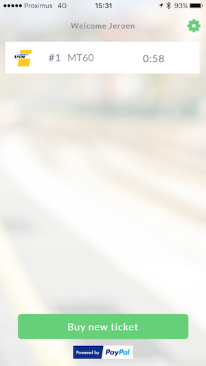
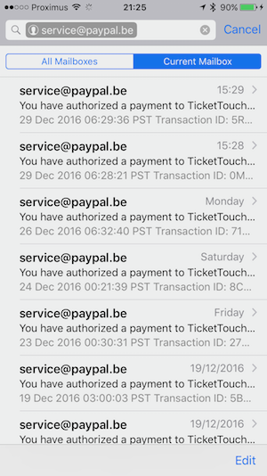
The best gets saved for last. I’ve had a case where I chose “Purchase 60 minutes M-Ticket” and I didn’t get a ticket. It showed the off-center “Purchasing” for a while and then showed the main screen again with no ticket purchased. I tried again by tapping “Purchase 60 minutes M-Ticket” and then it worked. A minute later I get two PayPal emails charging me for 1 ticket each. This is a major usability problem. We are talking about customers being charged for tickets they are not receiving. You can see the screenshots I took and compare the time of the tickets. 2 mails from PayPal, 1 valid ticket.

TicketTouch UI Paypal mail

TicketTouch needs a lesson in how they should make a user-friendly application. When a customer made the intention to purchase a ticket he _has_ a valid ticket. Instantly. He tapped “Buy”, he cannot in any way be faulted for any software bugs that happen after that. What happens now is that the user does not have a ticket until the long processing of the purchase has completed. In urban areas with spotty reception or on moving trams and busses this can prove difficult. But this should not be the user’s problem. What should happen is that the user has a valid ticket as soon as he hits “Buy”. There are 2 ways to do this:

  • Either TicketTouch figures out a way to make payments go faster. I don’t know what they’re doing now but in areas with perfect reception making a payment takes 20 seconds. There is a whole lot of computing that can be done and traffic that can be sent over the network in 20 seconds.
  • Or TicketTouch delivers a valid ticket and then has the backend figure out the payment if it takes too long to give the user instant feedback. If the payment comes back OK then nothing needs to be done. If an error occurs during the payment the user should be notified and the valid ticket will be invalidated.

When a timeout occurs in the TicketTouch backend or when communicating with the customer’s phone this can't be an error that invalidates the ticket. That is not the customer’s problem. In case of a timeout, keep trying. If in the end TicketTouch can't get the payment to complete due to timeouts or bugs, that's a free ticket for the customer. It will save TicketTouch and De Lijn a lot more effort missing out on these tickets than it costs in support and time dealing with false payments that go through. Hopefully the customers of De Lijn will get a better mobile experience soon. They deserve it. An app like this is simple enough and the complexity is very low. It should be top notch if De Lijn wants to keep its customers happy, and paying.

How To Export Fields & Display Suite View Modes

One thing that's often forgotten when I see tutorials about exporting view modes the variable that ties it all together, the field bundle settings for a content type.

This has cost me hours to figure out, after which I forgot it and it cost me hours again, frustratingly trying to figure out why, with seemingly everything exported well, the content types would just not have the view modes that I configured in Drupal's UI.

I don't like to work with Features. Features are fine until they're not. Features generate conflicts and remain in an overridden state after a while. I don't like it. Features are a black box, but the black box does not "just work". Raise your hand if you've heard this before when working on a Drupal project in a team:

"Hey, I reverted the features but it remains overridden."
-- "Ahh yes, I don't know why. It's fine though."

So often everybody assumes it's fine but basically nobody has a clue anymore about what's going on with that feature in a website.

That's why with the last project I did I said, no features. We do everything in code. Which, admittedly, is a bit crazy too. You burn more time, and thus money, on the project putting all the field bases, field instances, Display Suite field info and Display Suite view layouts into code.

Panels and views on the other hand are easier when working in code. Adjust anything in a panel or view, export it. Copy and paste the whole thing into the panel or view's code file and you're good to go. Way faster than working with features.

Exporting fields

To export fields you can use Features, install the module and create a feature containing your content types' field bases and field instances. Of course you need to create your content type first which goes like this:

$my_content_type = array(
  'type' => 'my_content_type',
  'name' => $t('My content type'),
  'base' => 'node_content',
  'title_label' => $t('Title'),
  'description' => $t('My content type for my website.'),
  'custom' => TRUE,
);

$content_type = node_type_set_defaults($my_content_type);
node_add_body_field($content_type, $t('Body'));
node_type_save($content_type);

Exporting field bases

You take the field_base.inc file and copy paste each field base piece of code into a field_create_field() method in your own module's install file. I created a MY_MODULE.field_info.inc file because field bases are shared across content types. You can re-use them.

Exporting field instances

For the field instances I created a MY_MODULE.MY_CONTENT_TYPE.inc for each content type and, at first, copy/pasted each field instance bit of code into a field_create_instance() method in content type's file. Field instances are not shared and it's nice to keep them separate. Beware that when you modify the body field in a content type you don't field_create_instance but field_update_instance for that.

Because you don't do everything right the first time around and you'll be adding or shuffling fields throughout the development of the project I got tired of copy/pasting each section, seeing which field I've already done, afraid of having missed one. The output of MY_FEATURE.field_instance.inc is almost exactly what has to be copy pasted into MY_MODULE.MY_CONTENT_TYPE.inc so I've created a little sed command file that roughly whips *.field_instance.inc into shape.

If you put these lines in a separate file and then call: sed -f command_file MY_FEATURE.field_instance.inc you can almost copy and paste the whole output into your own file.

s/\$field_instances\['.*'\] = /field_create_instance(/
s/\/\/.*//
s/^\([ ]*\));/\1));/
s/^[ ]*return.*//

Exporting Display Suite view modules

To export view modes I use Bulk Export, which comes with Ctools. Just enable the module and you'll get a new item in the Structure menu of your Drupal website. Select which Display Suite view modes you'd like to export and it'll present you with code that you can copy paste into your code.

However, the field bundle settings, a variable that gets saved whenever you "add" a view mode to a content type does not get exported when exporting Display Suite view modes through Bulk Export. Nor does it get exported through Features, not unless you have an extra "Strongarm" module installed at least.

In Kristof De Jaeger (@swentel)'s YouTube video about exporting Display Suite view modes he also makes no mention of this. All he does there after having configured and exported his view modes is truncating the various ds_* tables in Drupal's database, but he forgets about the field_bundle_settings_* It "works" in his demo because he doesn't start from a clean database. But if you'd take the code and deploy it on a new website, that field_bundle_settings_* variable would be missing and the view mode would not be connected to the content type.

You can solve that nasty time-wasting problem by putting this piece of code into your install file for each view mode. In this case it's for the full view mode.

// Update view mode full mode for some content types
$bundles_full_view = array('my_content_type', my_content_type_2);
foreach ($bundles_full_view as $bundle) {
  $settings = variable_get('field_bundle_settings_node__' . $bundle, array());
  $settings['view_modes']['full']['custom_settings'] = TRUE;
  variable_set('field_bundle_settings_node__' . $bundle, $settings);
}

This adds a field_bundle_settings_node_* variable for each content type you want to use the "full view" Display Suite view mode for.

Install a module with _that_ variable defined in it on a clean database and everything _will_ work out of the box.

To recap, when you want to

  • export content types
  • export their fields and the fields' label settings
  • export the view modes used by the content type
  • export the Display Suite field settings

you have to

  • Add the content type through node_type_save()
  • Add each field base with field_create_field()
  • Add each field instance on the content type with field_create_instance(). This also contains the label settings (hidden, above, inline) and in which view mode they appear.
  • Add the field_bundle_settings variable with a variable_set() to tell Drupal which view modes a content type uses.
  • Export Display Suite settings and add the layouts and field info hooks to your code to tell Drupal about the layout in each view mode and the field attributes and extras that got added, if any.
PhpStorm And Git SSH Keys

PhpStorm has amazing git integration. Pulling (cmd+t) and committing (cmd+k) work like a charm and are visualised well. During a commit you can even select a file and hit cmd+d to see a last-minute diff of the changes you're about to commit. In that window you can still fix any mistakes that were about to be committed.

I set up a project recently that required a public SSH key to be on the server in order for me to gain access to the git repository. But when performing a git pull PhpStorm told me this:

Fetch failed: fatal: Could not read from remote repository.
Update canceled

No more information than that.
Now, `git pull` on the command line worked like a charm and debugging the SSH connection with `ssh -vvv my.git.host` obviously didn't show any problems.

The problem stems from the fact that PhpStorm uses the default public key to connect to a git repository and it expects it to be named "id_rsa".

I have multiple projects set up on different git hosts and it always seemed to take the right key. What happened to be the case though was that my ~/.ssh/config file always happened to have the hostname of git host as its "Host" entry.

This time I had set it up so that "Host" was named something else and "HostName" had the actual fully qualified domain name.

Of course when PhpStorm pulls or pushes to the git repository it checks the config file of the project's .git folder and that will have the actual hostname in there. It _does_ check for an entry in your ~/.ssh/config file but in my case it did not find a "Host" entry with the name it was looking for. When PhpStorm does not find a matching entry in ~/.ssh/config it will default to using the key with name id_rsa.

I did not have an ida_rsa & id_rsa.pub key pair in ~/.ssh so PhpStorm failed to connect to the git repository.

The two things you can do to fix this are:

1) copy the public and private key-pair you'd like PhpStorm to use to id_rsa.pub and id_rsa respectively

or

2) Rename the "Host" entry in ~/.ssh/config to actually match the domain in the project's .git/config file

Gripes About Open Source Software

Naturally, I think, when a product gets chosen to solve a certain problem there is a certain naivety with people that nudges them into thinking that the product they’re going to rely on actually works as they expect it to work. It isn’t until after you’ve spent time studying and using it, when the initial shine comes off and the true product starts to show itself, that you know if it was the right choice.

Another factor that heavily influences the choice made is the cost of the product. Open Source Software is often free, and that is great. That is to say, it’s free up front, you have no idea about the Total Cost of Ownership down the line. It may not cost you cash to obtain the product, but it might still cost you time, and thus money, trying to understand how to use it. To the decision-maker however, free is a very powerful argument.

And then there’s a third big influence when you’re choosing a product, whether it be as a company to be used by your developers or by yourself as a developer, and that is the idea that Open Source Software is malleable. You can modify it to fit your needs. Even if it doesn’t completely solve your problem out of the box, it can be made into something that does.

The first factor is not a jab at Open Source Software as such. Closed software can be terrible as well but I’m willing to argue that with OSS it’s more of a crapshoot. Closed software is usually paid for, there’s a business model involving money. The company distributing the software needs money to survive. If they sell bad software they will cease to exist. So unless the product you are about to buy is really new, you can be fairly certain that it works well enough. With OSS this is much more of a gamble because there is way more choice. When choosing a product, or framework, or even Operating System you don’t know whether it will work, whether you’ll find and get support, whether the product will get abandoned or if something new shows up and steals the show. Imagine how a company must feel if they trained all their developers in Angular only to be outdone by Polymer a year after.

The second reason, the cost, looks good on paper because there’s a nice 0 in the “Total Amount” column. Projects get sold on the premise that cheap solutions stay cheap, but that is not guaranteed. Especially not when the developers have never used or integrated that software package. No trustworthy estimate can be made and there is a chance that the project starts slipping and goes over budget. The further the project advances the harder it becomes to drop the problematic free software because of the billed man-hours invested in it trying to make it work.

Third, there is the idea that when you have the code, you can change it. But when software gets chosen in the hope that it solves a problem for your customer, you can safely assume that you do not want to get involved in the development of this product. You do not want to help improve the software. You want to get in and out. The company chose it for certain reasons, one of those was cost. You don’t generally want to skim the profit your company makes by fixing bugs in a product that isn’t your company’s. I’d even say you can’t, without asking.

And then the call comes in. The client has a problem. They try their best to come up with a vague problem description and off you go. You start debugging. You dive into the product you hardly know anything about. Though as a developer you have knowledge of two incredibly simple but powerful tricks. You know how to print text and how to tail a file.

This brings me to the biggest gripe of Open Source Software. The incredible amount of time wasted on Open Source Software by amateurs, enthusiasts and developers that don’t know the software, but they know how to error_log and System.out.println and printf. Trying to work their way through code, hunting for that one bug that’s making the thing they want to work not work the way they want it to. And then, after hours of hunting they find the problem and they go on freenode to ask for help about the next step.

There, in that project’s IRC channel on freenode, they’re then told to write a bug report with a reproducible and if possible a publicly accessible test-scenario. They’ll spend another hour or so gathering their thoughts, writing it up in a forum they first had to create a new account for only to have their bug sporadically looked at and either forgotten or, if they are lucky, fixed in a release months, if not years, from now.

The sheer inefficiency in much of the Open Source community is mind-boggling. I think it’s beautiful that so many amateurs put in so much of their free time into helping out. But it is sad that all that time is spent so inefficiently compared to what a full-time developer that knows the product can do. A developer with the right debugging tools to cut through the product with much more ease than someone who spends a day looking at code he’ll never look at again.

That last bit isn’t even true. When in the future that client calls again with another problem you’ll be back at square one:

error_log(“Do we get here?”);

Link Exposed Filter-Block To Panel Page In Drupal

Creating a search page in Drupal is easy, exposing a filter in a block is easy too. The exposed filter-block knows where to submit the query to because it knows about the path of the search page.

But if you don't want to create a search page, just a Views content pane and insert that in a panel page, the exposed filter-block does not know where to go to as a Views content pane does not have a path. The trick here is to set the "Link display" to "Custom URL" in the Views content pane's "Advanced->Other" settings and fill out the path of the panel page that holds the Views content pane.

For instance, if you've made a panel page with "search" as the path and it contains your Views content pane for search-results... then set the "Link display" for that Views content pane to "Custom URL" and "search". Now the exposed filter will link to the search panel page.

If all else fails you can also try to set "Use Panel Path" to "Yes'".

Remotely Administering Your Grandparents' Computer

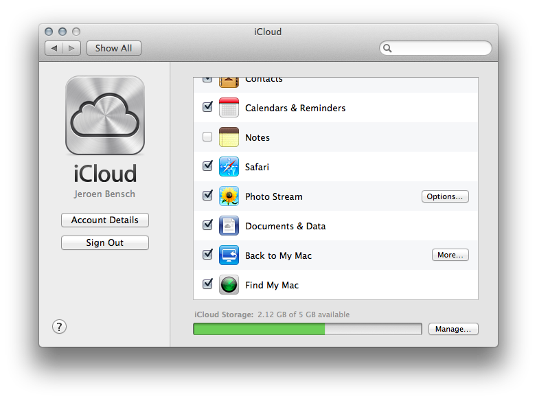
When I got my granddad an iMac I knew I was going to have to administer it remotely. OS X makes this easily configurable, and I will go through the steps of setting up your parents' or grandparents' Mac. First of all, set up the new computer like you normally would if it were your own. Choose a username for yourself in the setup, not the one for whom the computer will be for. The account for your parent or grandparent will be added later. The first account created during setup of the computer has administrator rights. If you are doing this on a computer that has already been set up for your relatives then you will have to add a new user account and make sure it can administer the computer. Modify the already existing account and uncheck the "Administer this computer" checkbox so they cannot administer the computer anymore. Effectively making your new user account the sole administrator of the computer. When the initial OS X setup has completed and you are logged in with your own account, make sure to go to System Preferences->iCloud and check that "Back to my Mac" is turned on and functioning properly. The other iCloud functionality can be turned off. All you want is to be able to reach your parents' Mac over the Internet when they turn it on.

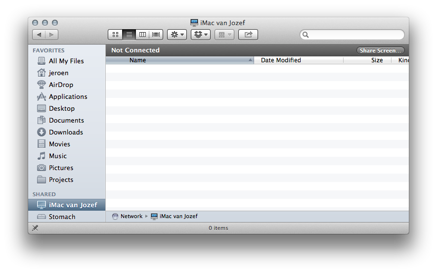
You can verify whether it is working if you see the newly setup computer in the "Shared" section of Finder on your own computer. The screenshot below shows "Jozef's iMac" in Finder.

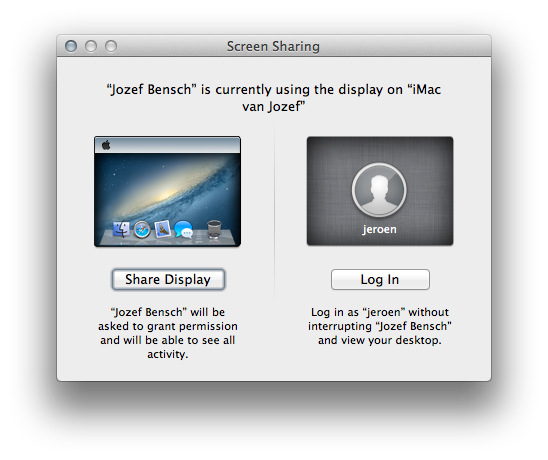
If you do not see the computer in Finder then check System Preferences->iCloud again. It could be that Back to my Mac gives a little warning about it not being able to connect to the Internet. A setting might have to be changed on your parents' wireless router. The router needs NAT or UPnP enabled. Once this works go to System Preferences->Users & Groups and add a user account for your parent. Make it so that "Allow user to administer this computer" is not checked. You will be the administrator, not them. When they have their own account you are done. You can go home and every time your relative turns on the computer you will see it appear in your Finder's Shared section. Now here's the genius. Back to my Mac doesn't just allow you to administer a Mac remotely, it also lets you help your parents or grandparents use their computer. When clicking "Share Screen..." to connect to the remote Mac you will be presented with the option to log in as the administrator without interrupting their session... but also to share their screen in case you need to assist them.

This makes it such a safe bet buying relatives a Mac if you have one yourself already. The software to administer it and help them if they need assistance is built right in, it's beautifully integrated and easy to understand. I think it is one of the unsung advantages of Apple's OS X eco-system.

Drupal 7, Multilingual, Panels and Node IDs

When working with Panels in Drupal 7 it is possible to add an existing node to a panel. The relevant part of the UI looks like this:

Its help text says you can just type the node ID straight away, or use URL arguments to identify them. This works as long as the website isn't multilingual. As soon as it's multilingual though the ID entered in this field doesn't have to be node ID but the translation node ID, or tnid, of the node that has to be displayed in the panel.

The help-text in that case is wrong.

You'd expect you'd be able to add the node ID and Drupal would get the tnid of the node when it needs to display it, but it doesn't. It just assumes it is the tnid and shows the node in the correct language with that tnid.

About BNP Paribas's Horrid Easy Banking app

A while ago I wrote about the BNP Paribas Easy Banking app for iPhone and how it has different password input validation than the input field on their website for Belgian customers.

After using the app I thought I should write about it some more. I care very much for details in a product, especially if I know the producer of the app has the means to put in the effort of taking care of every little thing. BNP Paribas is a bank, they surely have a lot of money. The problem is of course that they're a bank. That means they move at glacial speeds when it comes to technology. This has always been common knowledge but it's not just a myth, it's true as I know someone who works there as a developer.

BNP Paribas is a French bank, that implies their English is abysmal. This too, is common knowledge. Here's one example.

"This is your first time connexion"? Are they serious? Things like that irk me. But we're not done yet, here's the next screenshot.

"Please send once an empty texte message..." That is so French (they even spelled "text" in French) it's hiliarous. The whole explanation does not make much sense either. Also, there are arrows on the bottom that don't do anything. There is no previous or next page. You could argue that they're greyed out and that they'll become active as soon as there is a page to switch back to. I've looked through the app and found a section where there's more navigation possible. When on the home-screen, you can try and tap on the hard-to-hit "Troubles signing in?" text which does not look like a link or a button at all. When tapping it you end up at the professionally named "faq logon" section where UI atrocities like this take place.

I can't find a fitting description here. Do the BNP Paribas developers even know what they're doing? Is there anyone in charge of UX? I think it's safe to say that, seeing as we're discussing a bank here, there is no-one in charge of design and UX. The page has a back button, awkwardly placed underneat the "Close" button... and the arrow-keys on the bottom are still showing and still greyed out. I haven't found a place where they have a purpose. It's a sad state of affairs and these are just three examples, there are more.
Have you noticed how, in the screenshots, the app is not optimized for iPhone 5? I happen to have one, and I'm sure a lot of their best clients carry do too. The iPhone 5's been out for almost half a year now, it wouldn't be a bad idea to cater to their clientele.
BNP Paribas Belgium, if you happen to read this...

  • Please, have your app proofread by someone who's a better English speaker.
  • Don't prompt us about our apps being in Dutch because our "contract" is in Dutch and then show an English user interface. If you want to do it right you have us set the language in the app.
  • Upon starting the app we do not need a seven second animation of the BNP Paribas logo. We just want to get stuff done.
  • Optimize the Easybanking app for the iPhone 5. You make yourself look bad not doing it.